Thursday, 10 December 2009

Evaluation

Evaluation

1)In what ways does your media product use, develop or challenge forms and conventions of real media products?
After doing a large amount of reserach I had enough knowledge of the forms of conventions horror film trailers to create a successful trailer aaswell as ancillary texts that follow these conventions.
Trailer- A trailer must be tense, build up to a climax and not tell to much of a story. We followed the conventions of the trailer as our trailer is gripping, there is tension and suspense leading to a climax. However we chose to develop this as we have a short story at the beggining including captions. There are not too many captions in horror film trailers but we chose to challange this convention by using more. I think it has work incredibly well as it doesnt tell a whole story but enough to get the audience interested. The captions are gripping and audiences will definately want to know more. We also used and followd the conventions of the music in horror trailers. The music is used to build up tension and add to the effects the footage is trying to create. It usually begins at a slow tempo and becomes faster as the editing gets faster. We have followed this as at the begining the music is eerie at a slow tempo an event happens and the music becomes faster and more aggresive along with the editing.
Poster and magazine cover- In both of these we have followed the conventions completely. The poster consists of a large image of the house we chose this as it is simple the main focus of the film and eye catching which is typical of horror film posters. Here you can see the comparison between our poster and other real media, showing how we have followed the conventions.


We added the caption at the top so it is not interfered with by the other text on the page which is usually the credits small at the bottom of the page which we have also done. Film posters always have a website so that there audineces can find out more, we have used this convention and added a website at the bottom of the page. The title on film posters are not usually placed at the top in the middle as this is too obvious and more for the comedy genre. We have followed this as our title is over lapping the house in the middle of the page to the right. It is in colour and stands out against the black and white house. Here we have clearly followed the conventions and all of these can be seen in the comparison above.

The film magazine cover contains photos of the two actors in the film which is typical of a film magazine cover.
Here again you can see the comparison of the two showing we have followed the conventions.


They do this as if the audience like the actor they will immdeiately see the magazine and want to read it to find out more. We have done this hoping it would have the same effect. Not forggeting the house which is the main focus of the film we have placed a small image of it in the back ground making it clear it is a horror magazine article. We have added caption such as ' Exclusive interviews with your favourite stars' Most film magazines do this as they know fans will want to read about the actors they like.

2)How effective is the combination of your main product and ancillary texts?
Our products all act as a sinergy and when they are combined there is a clear link between them. It is important for them to all be recognised for the same reasons so audiences will recognise an elemnt of one and link it to the other acting as a reminder for them to see the film. An example is the font we used. The font we used was called Bell and it was used on the Film poster and also the captions and title of the film. Although it was not used on the music magazine ocver as they would have their own fonts. These photos show the font we used.I think it is a very effective font as it gives an eerie impression telling audiences it is a horror.


We also used the same locations to have the same effect so audiences will again be reminded of what film it is and that they should go and see it. Pictures below show how we have used the house many times through the sinergy as it is the main feature in the film.


Overall, the combination of the trailer and the ancillary texts are very effective and meet the conventions of a horror genre sinergy. They attract audiences and will immediately trigger them into wanting to see the film.


3)What have you learned from your audience feedback?
I individually carried out a large amount of audience feedback, as this is who the trailer is aimed at and the reason for making it. So finding out what they thought such as, what worked well and what could be improved, is vital in order to make a successful product. I made two questionnaires and surveyed 20 people from our core audience. This is not a huge amount of people however I wanted this amount so they could give more in depth answers and I could analyses their suggestions closely. I learned that the audience know what they want to see in a trailer and this must be taken into consideration other wise it will not be successful.


I previously showed my first draft of the trailer to my core audience and I learnt a great deal from this which then allowed me to improve and re edit the trailer. Below are the results and analysis of this questionnaire.
As we are making a horror film trailer is is important that audiences know that it is of the horror genre immediately. I wanted to know if the draft of the trailer had this effect so i asked: 'Did you immediately know the genre of the trailer?'

I found that 16 out of the 20 immediately knew it was a horror trailer. This is good but could be better so that the whole of the audience know its horror and are immediately interested. When they elaborated and I asked what it was that made them think this, the comments they made included:


' It was the eerie music that let me know it was a horror'


' The dark atmosphere led me to think it was a horror or maybe a thriller'


' The images of the road were creepy giving me the idea it was a horror trailer'


From the rest of the results I learned they thought the music was the most intense part but a lower number thought the build up was, which wasnt what we wanted. The idea for our trailer was to make the audience on the edge of their seat. So to have this effect more we used more captions and louder music to increase the intensity.


I also asked if the audience knew what was going to happen. 3/4 of them said no which i thought was very good as we want to keep them on edge. Altough the rest knew what was going to happen this is typical of a horror genre as they music and tension builds up letting know audience somehting is about to happen. So nothing needed urgently changing.


My inital worry when being told we had to make a trailer was that it would look unproffesional and un believeable so i asked the core audience if this was the case. To my surprise the majority said it was believable which i was very pleased with and I more confident now that we have created a successful trailer.


I learnt that they thought the trailer fitted the horror genre conventions and that the trailer made them want to see the film which was the most important thing. Overall the audience feedback alowed me to learn what they wanted to see and their views and opinion so the trailer was altered to meet there needs and proved to be very successsful.

4)How did you use media technologies in construction and research, planning and evaluation stages?


As I am taking a media course there is alot of technology used in otder to show I have the skills and ability to use them.


For research I mainly used Youtube for analysis. This included the downloading of videos to post on my blog and completed a full analysis of the horror film trailer. This allowed me to get ideas of my own and research the conventions needing to be used. I found this very useful and easy to use as I ahve had enough experience using youtube for my personal use.


I also used google images to research a variety of things such as film posters and mag covers. I also found this useful as i could again see what conventions needed to be included in our own.


For planning the major media tecnology used was the blog. With easy access,the blog aloud us to post what we want when we wanted to. I prefer them a great deal to folders as they are simple,easy and more organised to use.It aloud me to clearly complete the plannign for all three texts and when i come to the construction of them the planning was there to help me.


This is a screen grab of my blog and it shows the stages of my planning in a reverse order.


The construction is the hardest section and where the most technology was used. For filming we used a video camera and tripod as seen below.


This was a new experience for me has I had rarely used a video camera and never a tripod. However once it was set up i found it easy as it allowed us to video a variety of steady shots. Howver i foud it difficult converting the film to our assigned computer as i found it a difficult process. Once i was shown how to do it i knew for the next time we uploaded film.

To take the photos for the poster and magazine cover we used this still camera. I enjoyed this and found it particularly easy as i have my own camera which i have used for personal use many times.


Once we had taken the film and photos it was time to start creating the text. For this we had our own assigned computer and used Adobe premier pro for the trailer and Photoshop for the other two texts.


I had previously had experience using iMovie but not Adobe premier. However we had a lesson where we were shown how to use it and i was amazed my how much could be done using the programme.
This is a screen grab of Above premier pro and below a photo of myself editing our trailer on the programme.


Creating the poster and mag cover was a relitavely quick prosess as I am experienced in using this.


After the construction I have completed a vast amount of evaluation. The main part is the stages of constructing. I found it useful to explain the stages of making so it is clear what im doing and the reason for it.Belwo are phots and screen grab of myself creating the textss. All of the evaluation is shown on my blog next to these images.


Overall I feel I have used a variety of technologhy to my advantage to complete a successful outcome.

Final Film Trailer


I am pleased with how our final film trailer has turned out. Initially being given the task I saw it as difficult and was worried about what the outcome might be. However by following the story board, filming schedule, the conventions of the genre and using the programmes well, I found it an enjoyable and achievable task. Using the captions in between each scene it builds up tension telling some of the story but not too much in order to intreague the audience and influence them to want to go and see the film. The font works well against the black background and are clearly and interesting captions.The music works well as it begins eerie and at a slow tempo fitting in with editing which at this point is also slow with relitavely long shots. As soon as the state of equilibrium is disturbed by an event (girl being found dead) there is a scream. The shots are now short and editing is faster as well as the music becoming more aggressive and upbeat.


Audience Feedback on Final Trailer2


The questionnaire results show what our audience thought of our trailer and I am impressed with the outcome. They are all positive answers that show our core audience were intreagued by our trailer and would want to watch the film.


The trailer is the most important part of the campaign. It is a teaser trailer and aims to tease the audience into wanting to see the film. After collecting audience's opinions we can see our trailer has done what it is meant to and has been a succes with audiences.

Producing the Film Magazine Cover

The second print section is the film magazine cover. This advertise the film as well as there being other extras including interviews, reviews and sometimes even spoilers. However we are only making the cover of the magazine. I found this particularly easy as the task last year as i have previously to create a magazine cover, contents and double page spread and mine turned out to be very successful. So the skills from this were used to create a film magazine cover for our trailer.

The conventions of a horror film magazine cover are a dark background with photos of the actors in the film trailer. This allows the writing and characters to stand out against it making it eye catching to readers. We have taken these into consideration and below is the final layout for the cover.

This is the camera we used to take the photos and the lead to transfer it to the computer. There was few problems with the camera that meant we could not take many pictures however these are the best ones and we will choose from them which are the best to use for the cover.


Below are the selected photos taken for the magazine cover.


1


2


3.


4


5


The photos we will be using for the cover is the 1st one of stacy as she is the main character she must be featured on the front cover. This picture works well as she is not showing too much expression whixh is a convention of horror film posters. The 2nd one. I prfere this one out of the three that are similar because it is a low angle shot. This shows the 'Man in black has power' has power, however in the magazine cover the Photo of Stacy is over lapping the 'Man in Black' showing she is not completely powerless. The pciture of the house will also be featured as a background but not the main focus point. We wanted to include a picture of the house as it is a main focus in the film as it is where all the problem is.


Below are the production stages of creating the magazine cover.

1 2


In the first image I have placed the picture of the house in the right hand side of the page not too large so it is not the main focus of the page. I have then cloned the bushes again creating a dark background.


In the next stage i cloned the house using a murging effect. I thought this was an interesting element and shows my knowledge of how to use photoshop.


The picture of the man in black has been added in the background and made darker. It is considerable large and towards the bottom of the page.

The photo of Stacy has then been added overlapping the man in black showing she is not completely powerless althoguh the man in black is considerably taller and wider showing he has power.


In the next one I added the title. I was influenced by the film mag called 'Total film' and called it 'Total flicks' I thought this was a good name as it explicitly tells the audience what time of magazine it is , and audiences interested in this will immediatley pick it p and there for see our film being advertised which is what we want.


This is the final version of the magazine cover. It is succesful as it follows the conventions and is eye catching. These conventions include the images of the actors, the title, date and price, slogan and subtitles.

I individually created the title, I chose a normal red font as it would stand out against the dark background. I then used the clone and blur edges tool to create a title that looks as though it is smodged maybe with blood creating the horror image. I included other names of films including our own as many magazines do this advertising preview specials. We also added a bar code in order to create the image it is a real magazine cover. Following the conventions the barcode is usually in a corner so as to not interfere with the rest of the page.

Wednesday, 9 December 2009

Producing the Poster

Having nearly finish our trailer, we now have to create the two other parts of the course work this is the film poster and magazine cover. Having done analysis on both I have enough knowledge in order to create successful products.

Looking at the poster first, we took a range of photos. They were mostly of the house which is the main thing of the film. This again was hard to create the right image along with the lighting whilst following the conventions of the horror film posters.
Below are initial layouts of our film poster.
1. This is the first layout I have created. The Labels shows the positioning of the items of the page. I have learnt from research the general convention of a horror film poster is there is one large image that covers the page. It is usually simple with a dark background so the writing will stand out. The title of the film placed at the top has not been decided yet. The logos are of the companies that have created the film which every poster has similar to the small print text at the bottom which are usually credits.


2. This is the second of the layouts and the one i prefer the most. The image again covers the page and will have a dark back ground. The logos are in the same position in order to not interfere with the rest of the poster. The title is in the bottom right hand side of the page which follows the conventions of horror posters more than than it being at the tom. The credits again are at the bottom of the page again so it can be seen but doesnt not interfere with the poster.


3. This is the last layout to choose from. It similar to the others because the image is in the same place. However the title is at the bottom of the page in the middle above the credits which is also tipical of horror posters. the logos and credits are again in the same place to not interfere witht the effect the poster will have. On this one the actors names are featured at the top of the page.


From the three layouts above the second one has been chosen to be the one we use for the poster. The reasons for this were that it followed the conventions more closely.The logos in the corners are in the perfect position as they do not interfere wuth the poster. The credits at the bottom middle of the page are in the perfect position but need to be made smaller so they can be read but doesnt over power the image. I think the title of the film works better as it is not a boring later of the title being at the top in the middle. We have chosen not to include the actors names as from doing research I found this is more typical of a comedy genre poster.


The image must be big and the main focus of the page, preferably dark so the writing will stand out.


Below are images taken for the poster.


The photo on the left is a photograph I have taken showing myself editing and creating the poster on Photoshop.


I have much experience of this as this is the programme we used for our project last year. We created an advert and mine was very successful meaning this year it was easy for me to create the poster as I knew exactly what i was doing.


Below are screen grabs showing the stages of creating the poster. I find these interesting as they show the development and improvement of the poster.
1.

2.


3. 4.


1. This is the first stage of creating the film poster. I used the image I took of the house and put it into a new document on photoshop. I then added a dark background and centered the house in the middle of the page making it large as it need to be eye catching and the main focus.
2.For the second stage i just lowered the saturation to give it an eerie effect making it look more realistic.
3. For this one I bought the saturation back up as it was not standing out against the background enough. I then cloned the bush on the side of the house in colour, covering the rest of the page.
I think this works well as against the colour the house looks eerie and as if it is a house in a horror film. Now the title of the film it has been added, following the layout in this position. We made it this colour as it is a common colour in horror film trailers e.g. for captions. This font will also be used on the poster.
4. Thye next stage is adding logos and text at the bottom. The logos are from farm reel productions and 20th century fox which are the companies that would make our film. They are small, positioned in the corners as to not interfere with the effect the poster will have. A convention of film posters is to have small credits at the bottom. The text on our poster reads:


There is also a website as this is a common convention on film posters allowing audiences to visit the site and find out more .


Final Poster

This is the final version of our film poster. We have added a caption at the top in order to catch the audiences eye. I think this poster works well as it is a good printed interpretation of our film. It gives audiences an idea of what the film is about and relates to it well. It is an eye catching poster based around the conventions of the horror genre. It is simple and shows the house is the main focus of the poster and film. The plain drak background makes it the main focus and allows the house to stand out against the rest of the poster. The font being the only form of colour apart from a little in the bush it stands out making it clear what the name of the film is making audiences remember it. When they see the trailer they will recognise the same font reminding them to see the film. Overal I think it follows the conventions of the horror genre, our criteria and does what a horror poster should do.

Saturday, 21 November 2009

Captions

These are screen grabs of the captions in the first draft of the trailer. There are seven of them all together. We used a black screen as this represents the horror genre and the white writing to make it stand out. We experimented with the postioning of them. Looking at all seven there is a pattern begining with the top right hand corner and then the left bottom corner and so on. The last caption reading 'Your Not alone' is placed in the middle to emphasise the effect it will have on the audience. They have to read it and it is large in the middle of the screen grabbing there attention. After each sentence we used dots to follow on to the next caption telling audiences there is more to come, creating suspense.


However after showing the first draft to our core audience there was lots of feedback on the captions. These are some of the comments our audience had on them.


'Black screen works well, looks scary, captions should be bigger' Male aged 21


'Captions should be more central' Female aged 18


'Captions should be in a bolder font, maybe with some colour' Male aged 40


After reading the comments and doing a larger amount of reasearch I realised these captions do not follow the conventions of the horror genre entirely. Looking at other film trailers I looked closely at the captions and found some examples of what ours should look like and what we should change.Also the last caption has a spelling mistake and should read 'You're Not Alone. This will also have to be changed.
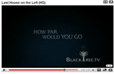
From my research i found these captions below that are from the film trailer 'The Last House On The Left' which is the one I thought was the best example of what the conventions of captions are.


The caption above is the one i find most interesting and effective. Here there is two statments that dissolve into each other with the second using the same previous words. 'If Someone hurt' fades away, however the word someone then becomes 'Someone you love'. These captions keeps the audience intreaged and will think this is clever, i would like our captions to have the same effect and plan to use something similar when re-editing.


My first inital thoughts on the captions in our trailer was that there were too many, however looking at 'The Last House On The Left' there is roughly the same amount and they work extremely well together. What I found out from this research was that captions are positioned in the centre of the screen in the majority of trailers. The font is usually solid and in a bright colour standing out against a dark background. Usually in captial letters the writing usually has effects such as dissolving , moving and fading in and out of each other. The one i have commented on above is the perfect example of this. I found in our trailer the dots after each sentence do not fit with this genre and are usually found more in the comedy genre trailers, which is not what we are aiming for in our trailer.

The font in the new captions will also match the film poster we will create later.

All of these will be taken into consideration when re-editing the trailer.


------------------------------------------------------------------------------------------


We have now re edited our trailer with the new improved captions, which now follow the conventions of a horror film trailer . Also using a comment posted on my blog the spelling and placing of the captions have been changed as well as the things noted above.Below is the last caption from our trailer. The caption is now in the middle with colour filled text and an effect around it. I believe this has worked better than the original captions we used in the first draft.