The conventions of a horror film magazine cover are a dark background with photos of the actors in the film trailer. This allows the writing and characters to stand out against it making it eye catching to readers. We have taken these into consideration and below is the final layout for the cover.
This is the camera we used to take the photos and the lead to transfer it to the computer. There was few problems with the camera that meant we could not take many pictures however these are the best ones and we will choose from them which are the best to use for the cover.

Below are the selected photos taken for the magazine cover.
1

2

3.

4

5

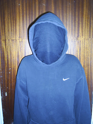
The photos we will be using for the cover is the 1st one of stacy as she is the main character she must be featured on the front cover. This picture works well as she is not showing too much expression whixh is a convention of horror film posters. The 2nd one. I prfere this one out of the three that are similar because it is a low angle shot. This shows the 'Man in black has power' has power, however in the magazine cover the Photo of Stacy is over lapping the 'Man in Black' showing she is not completely powerless. The pciture of the house will also be featured as a background but not the main focus point. We wanted to include a picture of the house as it is a main focus in the film as it is where all the problem is.
Below are the production stages of creating the magazine cover.
1 2

In the first image I have placed the picture of the house in the right hand side of the page not too large so it is not the main focus of the page. I have then cloned the bushes again creating a dark background.
In the next stage i cloned the house using a murging effect. I thought this was an interesting element and shows my knowledge of how to use photoshop.
The picture of the man in black has been added in the background and made darker. It is considerable large and towards the bottom of the page.
The photo of Stacy has then been added overlapping the man in black showing she is not completely powerless althoguh the man in black is considerably taller and wider showing he has power.
In the next one I added the title. I was influenced by the film mag called 'Total film' and called it 'Total flicks' I thought this was a good name as it explicitly tells the audience what time of magazine it is , and audiences interested in this will immediatley pick it p and there for see our film being advertised which is what we want.
I individually created the title, I chose a normal red font as it would stand out against the dark background. I then used the clone and blur edges tool to create a title that looks as though it is smodged maybe with blood creating the horror image. I included other names of films including our own as many magazines do this advertising preview specials. We also added a bar code in order to create the image it is a real magazine cover. Following the conventions the barcode is usually in a corner so as to not interfere with the rest of the page.

No comments:
Post a Comment