

However after showing the first draft to our core audience there was lots of feedback on the captions. These are some of the comments our audience had on them.
'Black screen works well, looks scary, captions should be bigger' Male aged 21
'Captions should be more central' Female aged 18
'Captions should be in a bolder font, maybe with some colour' Male aged 40
After reading the comments and doing a larger amount of reasearch I realised these captions do not follow the conventions of the horror genre entirely. Looking at other film trailers I looked closely at the captions and found some examples of what ours should look like and what we should change.Also the last caption has a spelling mistake and should read 'You're Not Alone. This will also have to be changed.
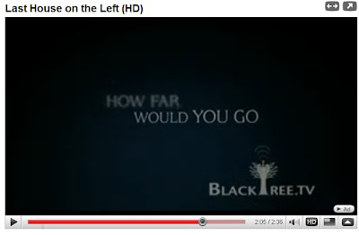
From my research i found these captions below that are from the film trailer 'The Last House On The Left' which is the one I thought was the best example of what the conventions of captions are.
From my research i found these captions below that are from the film trailer 'The Last House On The Left' which is the one I thought was the best example of what the conventions of captions are.
The caption above is the one i find most interesting and effective. Here there is two statments that dissolve into each other with the second using the same previous words. 'If Someone hurt' fades away, however the word someone then becomes 'Someone you love'. These captions keeps the audience intreaged and will think this is clever, i would like our captions to have the same effect and plan to use something similar when re-editing.
My first inital thoughts on the captions in our trailer was that there were too many, however looking at 'The Last House On The Left' there is roughly the same amount and they work extremely well together. What I found out from this research was that captions are positioned in the centre of the screen in the majority of trailers. The font is usually solid and in a bright colour standing out against a dark background. Usually in captial letters the writing usually has effects such as dissolving , moving and fading in and out of each other. The one i have commented on above is the perfect example of this. I found in our trailer the dots after each sentence do not fit with this genre and are usually found more in the comedy genre trailers, which is not what we are aiming for in our trailer.
The font in the new captions will also match the film poster we will create later.
All of these will be taken into consideration when re-editing the trailer.
------------------------------------------------------------------------------------------
We have now re edited our trailer with the new improved captions, which now follow the conventions of a horror film trailer . Also using a comment posted on my blog the spelling and placing of the captions have been changed as well as the things noted above.Below is the last caption from our trailer. The caption is now in the middle with colour filled text and an effect around it. I believe this has worked better than the original captions we used in the first draft.


this is really interesting work on the captions and I like the way that you are liking it to researched real media output - then prepared to re-edit. Check the spelling of your own captions carefully - the last one should be 'You're not alone.'
ReplyDelete